Studio practice
The flower game
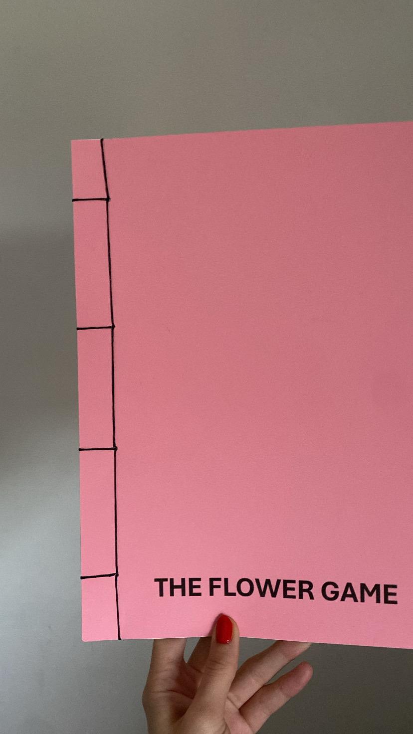
When printing the final "the flower seller" publication I decided to make a few changes. Firstly i added a page of text as an introduction, the text taken from a previous blog post. Adding the text caused me to change the title to "the flower game", this is a phrase mentioned in the introductory text so it felt more fitting. I previously mentioned that i wanted to change the size of the publication to A4 to accommodate for the lost space at the spine due to the new binding method. With the last zine i was happy with the new glossy paper for the main pages but didn't really like it for the covers, it gave the publication too much of a brochure feel. This time i chose a thicker card for the covers and i think it gave it a more professional feel. I was originally going to choose a blue colour for the covers, i made a last minute switch to light pink, i thought this could work visually with the board print when presented for the show. I did use the Japanese stab binding methods previously mentioned, this was pretty easy to do and i think it gives a good effect, the black waxed thread works well with the pink background and thick black text.
I am pleased with how this publication turned out. After making this piece I think i will remake the "flowers and lies" publication in the same style to exhibit together in the show.


Comments
Post a Comment